Robust statistics using boxplots
Just last month I blogged about different kinds of averages. Now young blogreader Jeff (NZ) has commented "In our school they only taught us about the mean . Tell us please : when would you use the median, and why?"
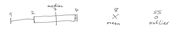
The median is more robust than the mean, Jeff, it copes better with occasional data errors. Here's an example. Assume we have 10 numbers in our data set and sorting them into sequence they are : 1,2,2,3,3,3,3,3,4,4,5. These add up to 30 so the mean is 3. With these 10 numbers the median (central value) is also 3. So far so good. Now assume you made an error entering the 5 in your data set, your finger jiggled, the key bounced and the number you entered is now 55 :-( The data now add up to 80 so the mean is 8. But notice that the median is still 3. The median is thus said to be more robust because it is less influenced by such data errors.
Now lots of statistics are done using the mean (and the standard deviation as a measure of spread). But these require that the data be distributed 'normally'. That means they are in the bell-shaped curve you may have heard about (also known as a Gaussian distribution after the german mathematician Gauss). But an awful lot of the data sets we encounter are not like this. They may be 'flat' (random). They may tail off (survival rates). So it would be nice to have some robust way of doing statistics regardless of the way the data are distributed.
Back in 1977 John Tukey came up with the box-and-whisker-plot for showing a 5-number summary of datasets whose distributions were not bell-shaped. Anyone remember John Tukey? He was the man who invented the FFT (Fast Fourier Transform).
How do you draw a boxplot? First find the first and third quartiles of your dataset.
25% of the data are below the first quartile, 25% are above the third quartile.
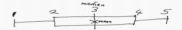
In the dataset we used above (1,2,2,3,3,3,3,3,4,4,5) the first quartile is 2 and the third is 4, as you can easily see.
Now just draw a box shape with its edges at the quartiles. Also draw a line across the box where the
median (= second quartile) is. The distance between the first and third quartiles
is called the inter-quartile-range (IQR) and is a measure of the spread of the data.
The IQR in our dataset here is thus 4-2=2.
The central 50% of our data always lie within the inter-quartile-range.
Now we'll add some whiskers to our box. Find the smallest data point above 1½ IQR below the first quartile. In our case this would be the datapoint with value 1. Find too the largest data point below 1½ IQR above the third quartile. In our case this would be the datapoint with value 5. These two values (1,5) are the ends of our whiskers.
So our box-and-whisker plot summarising our dataset now looks like this. I've drawn in a small cross (X) where the mean is too (you'll see why later).
Now let's look at the boxplot for the dataset containing the erroneous 55 instead of the 5. The median stays at 3 but the upper whisker is now at 4 because the 55 data point is WAY outside 1½ IQR. In fact it is even outside 3 IQR. Datapoints outside 1½ IQR are called mild outliers (and represented by a closed dot), and datapoints outside 3 IQR are called extreme outliers (and represented by an open dot), because they are extremely unlikely and so are suspicious and thus worthy of further inspection. We need to see if they are errors (as is the case here).
Box and Whisker plots are easy to sketch by hand from the data, you don't even need a computer, any arithmetic (e.g. 1½ IQR) is so easy you can do it in your head :-) This makes them a useful tool in your maths toolkit. And now you've just learned how to make them and how to use them to catch outliers. Dead easy wasn't it? :-)
Of course since the distribution of the data is irrelevant for boxplots, they also apply to normal distributions. One disadvantage as I see it, is that the regular boxplot does not show you the number of data points in the set (the so-called sample-size), so that I, personally, always write it next to the boxplot, e.g. n=10 here. That's 'cos I trust larger samples more :-)
In a later post I'll be showing you some non-normal data distributions (e.g. actuarial tables) and you can practice by drawing their boxplots if you'd like to try your hand :-)